

INTERACTIVE is a tool used to perform thorough root cause analysis for troubleshooting or to assist with supporting optimization opportunities.
|
The process for creating Views in OVERVIEW is as follows: Step 1: Search for Assets (sensors) that you wish to examine. |
|
|
The Search and Filter functions
The Search and Filter functions limit the number of assets or KPIs displayed, speeding up the creation of an Interactive study. For example, if attempting to do a root-cause analysis on a failing pump, you could limit the KPI search to Pumps and/or Motors, so that only assets with these metrics would be shown. This is particularly useful in plants with large numbers of sensors and KPIs.
Sensors/KPI Search
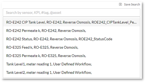
The KPI Search function allows the user to search through plant assets easily. As with other search options on the platform, it is easy to narrow down the search range by entering one of the following:
- Free-form text, such as pump, water, RO-1, etc.
- Hashtag search – typing the hash mark # into the search box will bring up a list of asset tags to search.
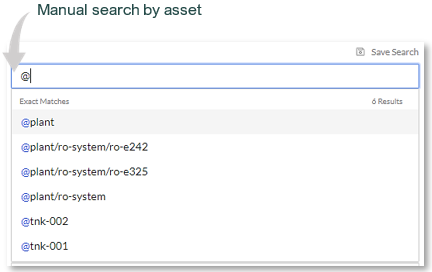
- Asset search – typing the @ symbol into the search box will bring up a list of assets to search.
Example:
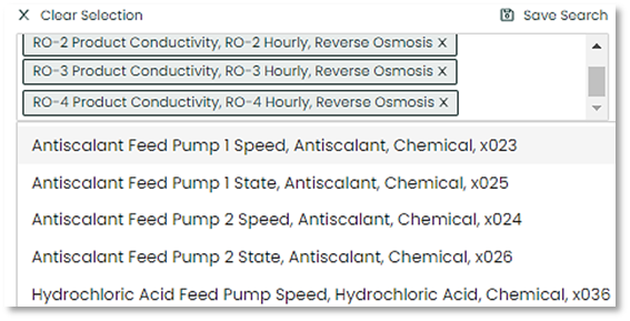
Multiple sensors and KPIs can be added to the KPI selection.
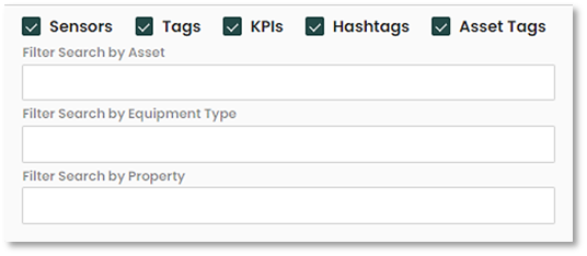
Filter Feature
The user can filter the sensors/KPI search in categories including Asset, Equipment Type and/or Property. This will selectively only add the related tags in the search option and help narrow down what you are looking for. Also using the check boxes, you can select what to include or omit from the search.
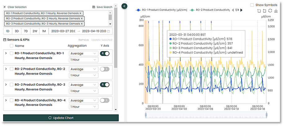
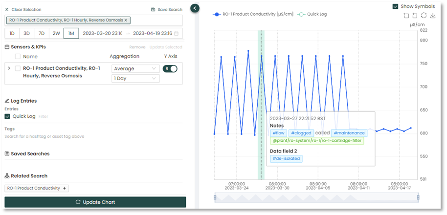
You can select the date range of the data you want displayed on the chart. The example below shows a one-month interval (1M) selected. In this case, if you click on the left side and then the right side of the calendar dates, you can view the defaults selected.
6-28 February and 1-8 March completes a fill months' worth of data selected.
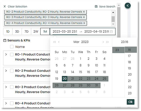
This can also be overridden by manually selecting the desired date range and time intervals using the calendar view.
|
|
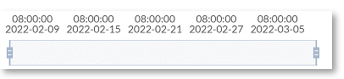
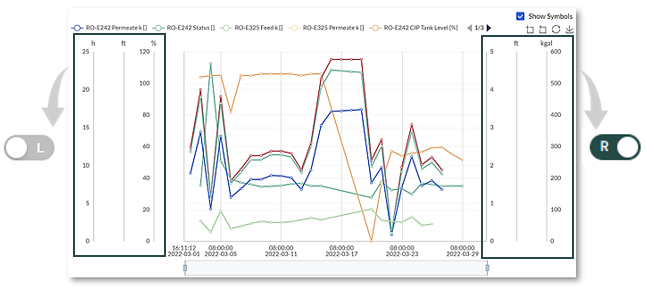
The bottom of the chart will include an updated timeline of your data. You can use the left of right sliders on the chart to adjust it to a specific area in the timeline.
Interactive Graph Metrics and Y-Axis Setup
This section allows the user to see what sensors and KPIs will included on the interactive graph and gives the option of choosing different y-axis per sensor.
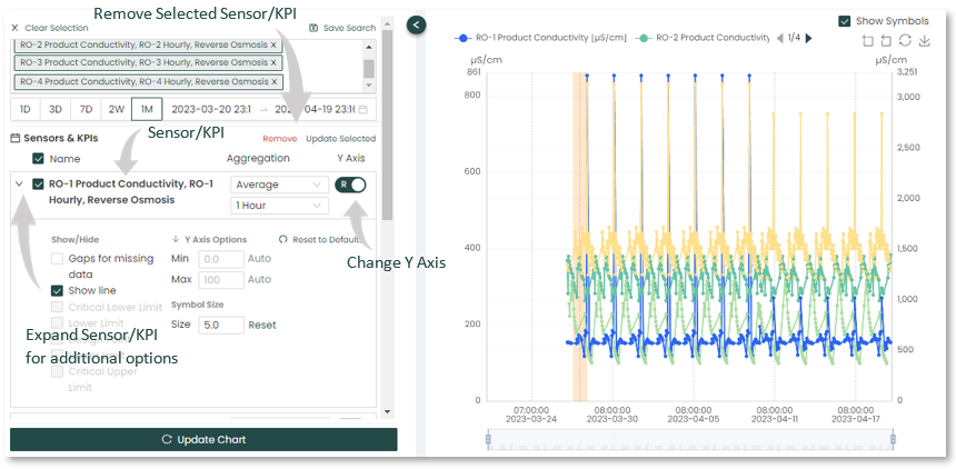
The Y-Axis labelled sliders indicate which side of the graph a KPI’s Y-axis scale will appear. In this example some of the graph scales are stacked on the left , while others are stacked on the right side of the graph window.
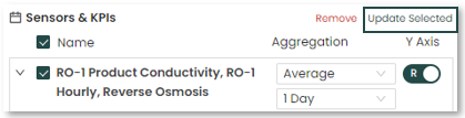
Clicking the “Updated Selected” reveals the Aggregation Settings box where you can choose the settings for multiple selected Sensors & KPIs instead of individually.
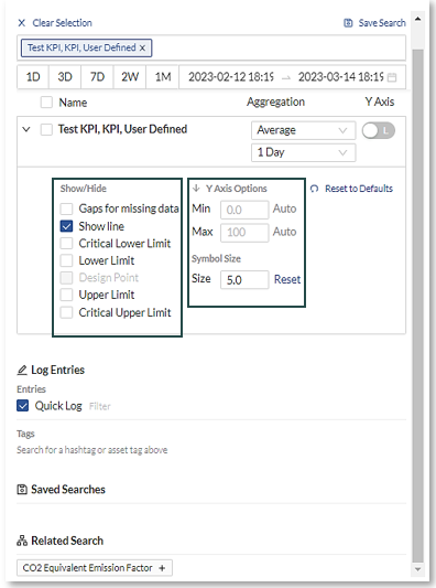
By selecting the KPI expansion (down) arrow on a particular KPI it is possible to further refine that KPIs behavior using Filtering.
|
Show/Hide
|
 |
|
Y Axis Options
|
|
|
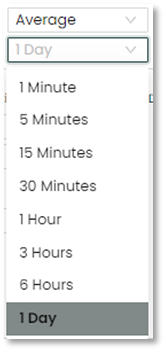
Aggregation
|
 |
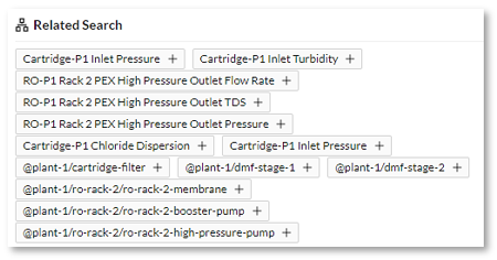
Related Tags search
The Related Search automatically updates all affiliated tags with the sensors/KPIs used in the search. This assists the user with related metrics/KPIs to help with the analysis.
Running you mouse over the graph allows you to interact with it. Hover the mouse over selected points to see additional data in popups for a given time period.
Log Entries
The Log Entries option displays the Operator logs as shaded bars within the graph. This provides additional context and Insights to plant operations at the time of the selected event. Moving the cursor mouse over the shaded bar brings up the log entry for the selected period.
Any search can be saved for future use.
- Click the "Save Search" located at the top of the menu bar.

- The “Saved Searches” save field will appear near the bottom of the menu bar.
- Enter a name for your saved search and click “Save”.
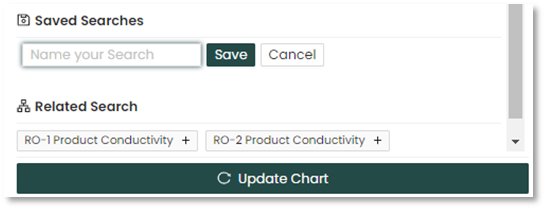
- The Saved Searches displays prior saved searches for easy retrieval and future use.
Interactive is a useful tool when you need to look closely at an individual asset over a period of time or compare assets when doing root cause analysis. For plant operators, the additional asset information can help them understand plant operations at a deeper level. For Process Analysts, it allows for more specific historical reporting when performing asset analysis.

