

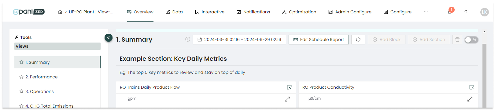
The Overview page is where data is visualized and presented for analysis and action. In Overview, users have access to pre-built dashboards called Views, and have the option to create personalized or customized Views as well. A View consists of one or more blocks - graphs, charts, etc - whose function is to display data from sensors or KPIs. The blocks are fully configurable, customizable, and designed to display current conditions and historical trends.
|
The process for creating Views in Overview: Creating a dashboard View :
Creating a block within a dashboard View :
|
Views are user-configured groups of KPIs and sensors that can be thought of as dashboards to visualize data and improve how that data is utilized. A few examples of popular kinds of Views to build to streamline operations in the platform include:
Summary:
We recommend that all administrators create a Summary dashboard. These are the key KPIs that all operators should review to ensure the plant is operating properly. It is also recommended that the summary dashboard’s usage be clearly communicated to all plant stakeholders to ensure consistent monitoring and analysis.
Performance:
This recommended dashboard drills down into various subsystems of the plant. For a Reverse Osmosis operation, for example, the performance Dashboard could include overall recovery or energy consumption over different systems.
Operations:
This recommended dashboard can show the status of different trains and individual train production, for example.
Maintenance:
This recommended dashboard can illustrate which systems may be experiencing more issues than others. This section could include some of the maintenance statistics including membrane replacement and cleaning.
What each facility wants to see, and how these are organized and what are displayed will vary based on factors like individual needs, available sensors, KPIs and operational requirements.
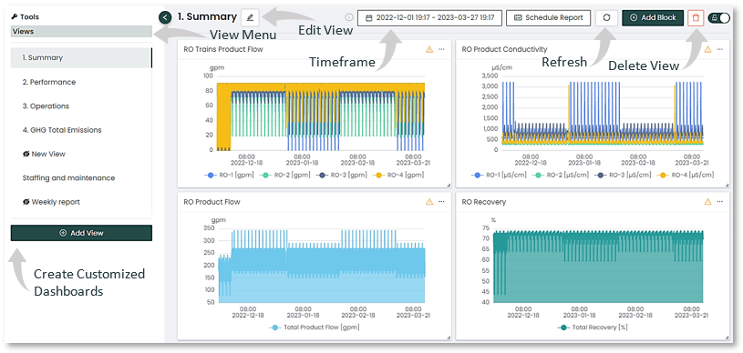
When looking at any View already created and populated with View blocks, a first step and best practice is to set the time frame. There is no automatic default, so if blocks appear to have no data, try adjusting the time frame. The time frame for the View can be customized with the Timeframe date-picker at the top, which is then applied to all blocks within the View.
Views and Block Types
Once you decide on the type(s) of data visualization for your operation, it is easy to create new Views.
Views are built on the concept of blocks, similar to building blocks. Each block is a way to visually represent some specific data, for example with a graph, line chat, pie chart, or text value showing a metric such as flow rate in gallons per minute. A View can therefore consist of many blocks, each built according to your plant's needs.
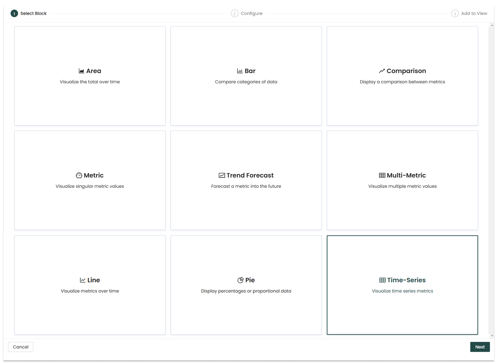
The types of blocks you can create are shown and detailed below:
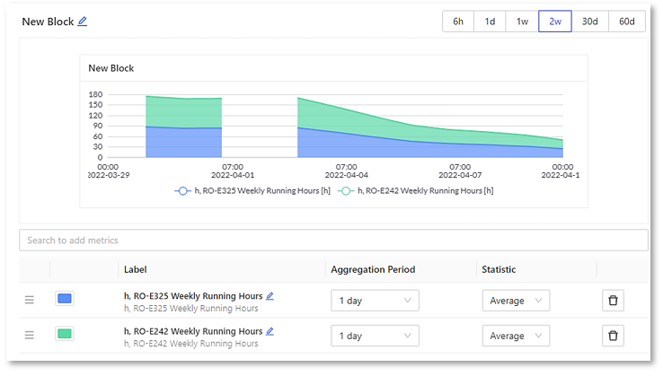
Area:
In this example you can see the area graph is being configured to show the statistics for two different RO aggregation periods. They are displayed stacked.
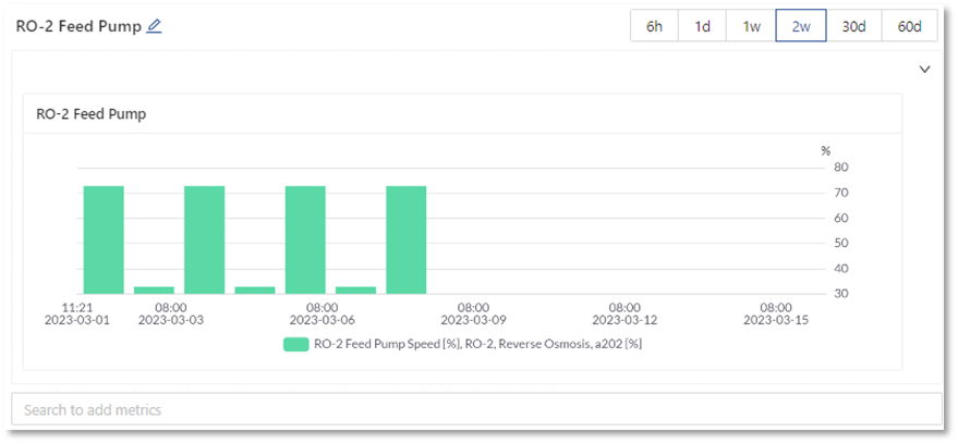
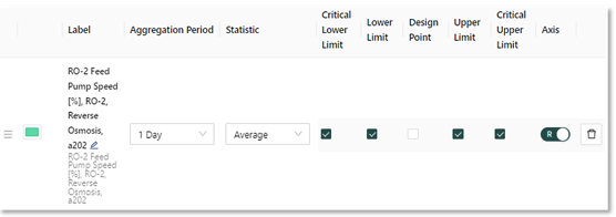
Bar:
In the example below the configuration and specified parameters of a “RO-2 Feed Pump” is shown with limits set and a scale indicating changes over a period of time for this bar graph.
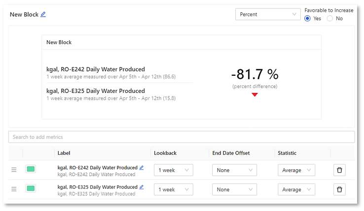
Comparison:
The comparison view here is being used to show a daily water production percentage difference between RO-E242 and RO-E325.
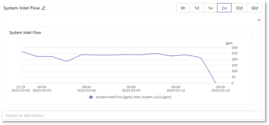
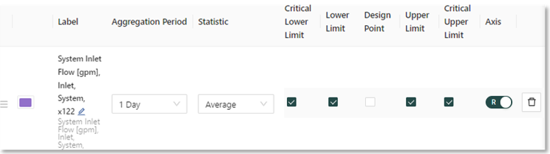
Line:
This line graph is configured to shows System Inlet Flow over a days average with upper and lower limits applied.
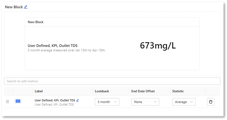
Metric:
In the example below a single metric is defined and configured to display a 3 month average measurement of a “User Defined KPI Outlet TDS”.
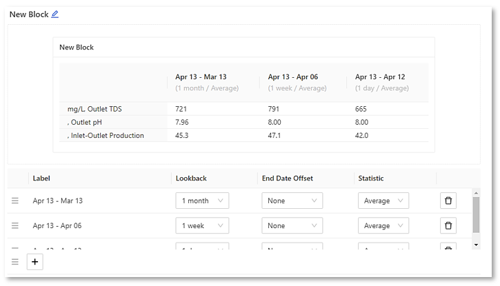
Multi-Metric:
This can be used to view multiple metrics with selected time periods on the same graph. It allows you to immediately compare several time periods and their impact, in this case averages of the selected metrics.
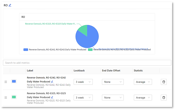
Pie:
In this example a pie chart being configured to showing the relationship of the daily water that is being produced between two different ROs.
Trend Forecast:
For plants that include the Trend Forecasting metric, see the Trend Forecast Overview Block article Here.
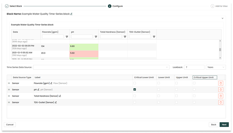
Time-Series:
The newest block type, Time-Series blocks can bring together different kinds of time series data (e.g. sensors, KPIs, logs, categoricals) to be viewed together in a single space-efficient table, similar to a spreadsheet. Critical lower limit, lower limit, upper limit, and critical upper limit thresholds can be selected to add coloured shading to cells indicating threshold status.
How to Create a View and Add Blocks
The steps for creating a View and populating blocks into a View are as follows:
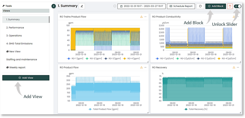
1. From the bottom of the left side bar, Select the “Add View” button.
2. Navigate to the new View in the side bar.
3. From the new View, unlock the page with the lock/unlock icon toggle switch slider in the upper right,
4. Click the "Add Block" button.
The image below shows the various steps from within an already-created View called "1. Summary"
2. The “Add Block” button ![]() will bring up a pop-up modal displaying the types of blocks to choose from.
will bring up a pop-up modal displaying the types of blocks to choose from.
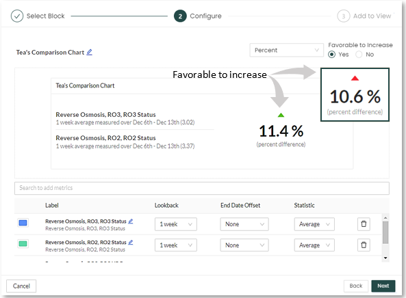
3. Select the type you would like to use for this particular block. For this example, Comparison is chosen, which compares two metrics.
4. Once the graph type is chosen, it’s time to configure the options. Give the New Block a name by editing it with the pencil icon, and proceed to setting the detailed parameters.
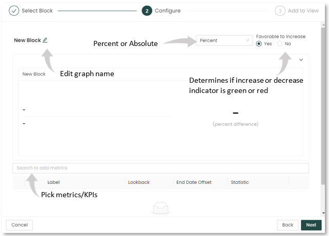
To configure the comparison:
- Decide if the values displayed will be a percentage or an absolute value.
- Select the “Favorable to Increase” setting. If set to “Yes”, increases will be shown with a green arrow, indicating improvement. If set to “No”, they will show as red.
- Select the KPIs to compare. You can easily search KPIs by typing in part of the KPI name (pressure, RO-1, feed, etc.) which will limit the number of KPIs to search.
- In the example below, the key performance indicators (KPIs) for comparing reverse osmosis (RO) status are selected.
5. When fully configured, the Add Block button in the lower right of the modal will save the block add it to the View.
Organizing Views
You can organize Views a variety of ways.
Organizing Views in the left menu
Once you've created a View, you can name and choose the order it appears in the left side menu.
- Manually drag and drop to move Views into the order you'd like them to appear
- previously put into alphabetical order by default, now can be arbitrary
- previously put into alphabetical order by default, now can be arbitrary
- Nesting hierarchy means you can make Views 'parents' or 'children' or 'siblings' of other Views
- Simply drag and drop according to the underline that will appear to indicate new placement
- Simply drag and drop according to the underline that will appear to indicate new placement
- Newly created/added views will appear to the bottom of the list
- these will default as a 'sibling' (without any 'parents')
- these will default as a 'sibling' (without any 'parents')
- Name and rename Views as you like
- The title update box is always in "edit" mode
- Simply click into the title box, press enter to submit changes, and click away to reset
![]()
Organizing View blocks
Once the block is built and appears within the dashboard View, it can be moved or resized as desired on the screen.
- To move the block, click and hold the blank space in the header bar beside the name and drag to the desired location on the page.
- To resize the block, click and hold the
 right angle icon in the lower right corner of the block, activating the resize cursor, then drag to and release at the desired size.
- To organize a group of blocks into clearly grouped and labeled sections, unlock the View, then the
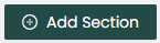 "Add Section" button in the upper right part of the screen will become active.
- This will add a full-width title and description text block that you can place as a horizontal break and adjust the height as desired.
- This will add a full-width title and description text block that you can place as a horizontal break and adjust the height as desired.
Editing Views
You can edit Views at any time.
To edit a View:
- Within the desired View, click the lock/unlock slider switch in the upper right to move from the locked position
 to the unlocked position
  to allow editing.
 - Once unlocked and editing is enabled, select the pencil icon
 in the upper right corner of the block to make it editable.
 - You can also duplicate with the
 double-pages icon, or delete with the
  red trash bin icon.
Using Views to create dashboards is a great way of presenting information to specific users. Create a View for senior managers, for PAs, or specific operator actions. You can also use Views to create weekly or monthly performance report. Screen capture and email Views to executives as a quick weekly update. There are lots of uses, and the breadth and depth of the Overview reports allows you to visualize plant data in many ways.
Scheduled Reports
A powerful feature of the Overview reports is that they can be scheduled to go out to selected recipients by email distribution. This allows you to create regular reports at your desired intervals - for example, a weekly operations report that sends to key stakeholders every Monday morning at a specific time.
|
|
![]()
|
The process for creating Scheduled Reports is as follows:
|
|
|
Other examples of scheduled overview reports are:
- A monthly executive report on plant production
- A weekly report formatted for mobile devices that goes to plant managers
- A bi-weekly report used to update an operational meeting
- A daily report that monitors a new or recently repaired plant asset, along with upstream and downstream assets, for proper or continued operation
- A weekly summary of logbook entries
- A monthly summary of Alerts or insights that have been triggered
To set up a scheduled report, click on the “Schedule Report” button in the upper part of the screen to open the “Report Schedule” pop-up modal. The first section at the top of the modal is where to add your email report recipients with the “Select recipients” button. This will bring up a new pop-up to select the specific users from the list of users presented. You can edit and add to this list as needed after the report is set up initially.
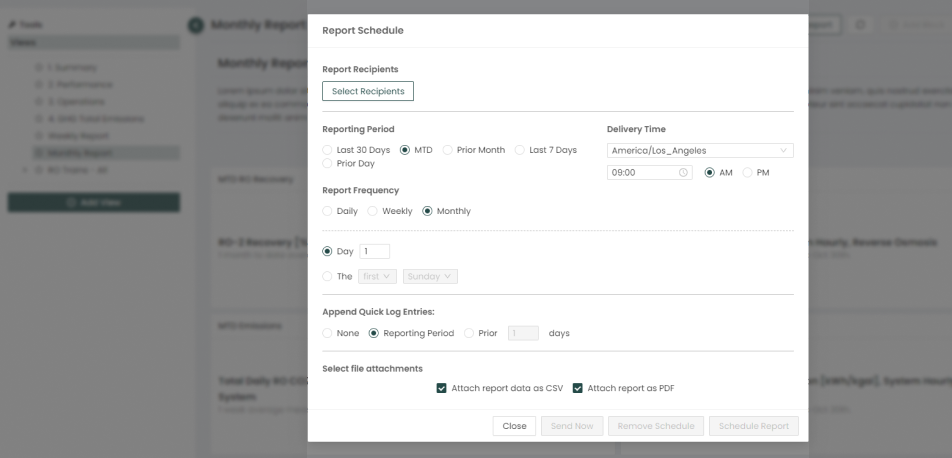
The Report Schedule pop-up modal allows you to customize key details:
- Reporting Period
- Last 30 Days,
- MTD (Month to Date)
- Prior Month
- Last 7 Days
- Prior Day
- Report Frequency
- Daily, Weekly, or Monthly, with expanded options for each
- Delivery Time
- Time zone and time
- Append Quick Log Entries
- None, Reporting period, or specific number of days prior to send date
- Select File Attachments
- CSV of report data, organized alphabetically (by name of block first, then alphabetical order of sensors)
- PDF report, similar to how the View being reported is displayed in-platform (organized 2-up on, landscape, 8.5"x11" page)
- None, which will result in a link in the body of the email to view in-platform
Once your entries are completed and saved, you have various schedule options, including:
- Send Now to send the report immediately (on-demand)
- this button activates when the report has been scheduled and at least one recipient is added
- can select current date or a custom date range, helpful for custom schedules like 4-4-5 week periods
- Remove Schedule to delete the scheduled report
- this does not affect the View blocks
- Schedule Report will save the report
- required to enable Send Now option
Once you have saved your report with the “Schedule Report” button, the "Schedule Report" button on the Overview page will update to display “Edit Schedule Report” indicating there is now already a scheduled a report for that particular View.
Pro tip: Depending on reporting needs, clients can set up the View to have the information needed in a particular order, then copy and paste data from the CSV emailed with the report into their designated reporting workbook or sheet. In other words, if you set up View blocks to show the aggregations you want within that View, say average production or rainfall, then you can export that data to CSV (or have it sent to you automatically in a scheduled report from that View), then simply map over the data to your other spreadsheet that you'd normally enter values into manually.
o
|
|
Troubleshooting: If the report you want to generate is unsuccessful, the most common cause is too many blocks in that View, exceeding email size limitations. In this case, try splitting one large View into smaller pieces, such as two or three more manageable sized Views.
Ask us: Got a complicated reporting situation? Reach out any time. We're happy to put our heads together to see if we can help figure out an easier way.
For support, questions or comments on anything shared here, simply log in through the Pani Support Center and submit a ticket, or send an email with the details to [email protected]

